The 5 Best Skin Care Web Design Examples In 2023
Updated: Feb 22, 2024
Our Favorite Skin Care Web Designs!
Due to its many benefits, having a skincare website is essential for the owner of a skincare clinic. A skincare website can establish a great internet presence, as well as showcase a business's hair products and beauty products with their online store. A skincare website functions as a virtual clinic, building client confidence and trust while providing a centralized platform for service promotion and public interaction. A website is an essential tool for skincare clinic owners in the modern digital age to grow their business and draw in new clients. The top 5 website designs from skincare clinics for 2023 have been compiled by Crystaylor Creative and are shown below. Hopefully these websites can be of inspiration for your brand.
1. LocoCoco Aesthetix

LocoCoco Aesthetix offers a diverse range of exceptional skincare services to clients to its clients on the island of Oahu. The website, meticulously crafted by Crystaylor Creative, presents a captivating and clean design that perfectly embodies the essence of beauty and rejuvenation. Through a harmonious color palette, elegant typography, and high-quality imagery, the website creates an immersive and alluring ambiance for visitors. User experience is prioritized, ensuring effortless navigation and seamless exploration of the shop's extensive offerings. Well-organized menus and carefully categorized sections empower users to effortlessly discover their desired skincare treatments, product lines, or specialized solutions they seek. LocoCoco Aesthetix's website is a great example of a well thought out website in the skin care and beauty industry.
2. Rejuve

Rejuve, a shop which provides skincare services, seamlessly combines the worlds of beauty and wellness to offer an extraordinary experience to its clientele. With a strong focus on safety, efficacy, and tangible results, Rejuve is dedicated to providing state-of-the-art skincare treatments and innovative solutions. The shop's unwavering commitment to professionalism and creating a tranquil environment ensures that customers can indulge in a rejuvenating skincare experience. Mirroring its exceptional services, Rejuve presents an equally remarkable website design. Crafted by Crystaylor Creative, the website serves as a virtual gateway to the skincare shop, capturing the essence of its luxurious and serene ambiance. From the moment visitors land on the homepage, they are greeted with a visually captivating layout, with vibrant colors and pictures, that reflects Rejuve's unwavering pursuit of excellence.
3. Deeponde

Deeponde, a renowned products based Korean skincare brand, showcases a strategic use of color in their website design, demonstrating their astute understanding of its significance. The brand's deliberate selection of a specific color scheme establishes a cohesive and inviting atmosphere for visitors. The carefully curated blend of colors contributes to a harmonious and captivating ambiance that aligns perfectly with DeepOnde's brand identity. This consistent color palette extends beyond the digital realm and creates a unified visual experience across various touchpoints, including product packaging and physical brand elements. By maintaining this consistency, DeepOnde fosters strong brand recognition and recall among potential customers. Encounterings the same colors associated with DeepOnde, whether online or offline, helps create a deeper connection with the brand and instills a sense of familiarity. This not only enhances brand awareness but also reinforces the brand's unique identity as a provider of high-quality Korean skincare products that promote beauty and wellness.
4. Bite
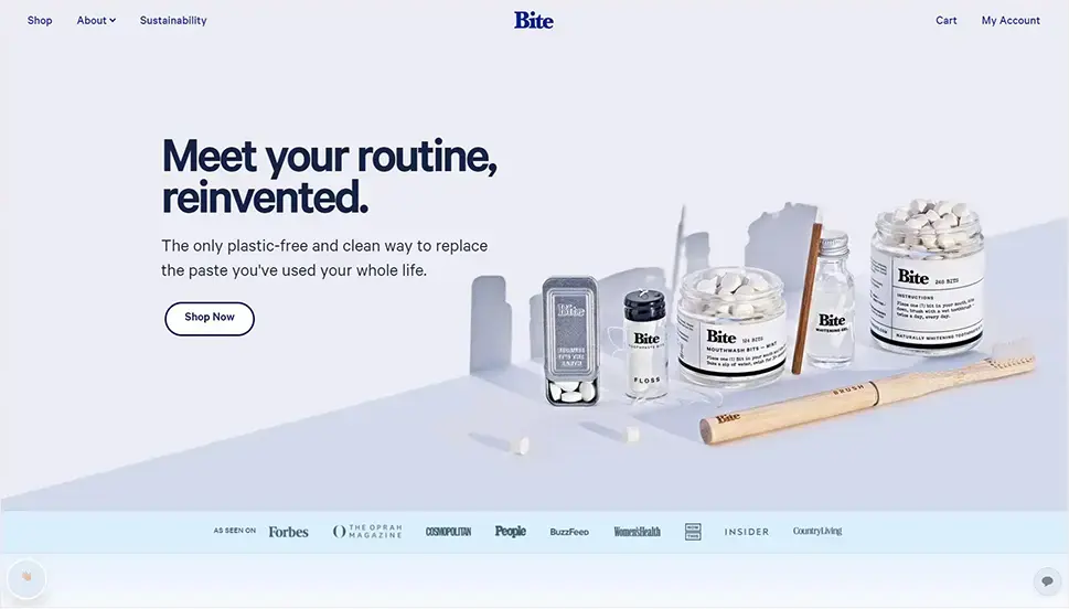
Bite, a distinguished skincare brand, stands out for its exceptional portrayal of its staff on their captivating website. The website's remarkable design not only showcases stunning photographs of the brand's team but also pairs them with heartfelt captions. This approach adds a personal touch and cultivates a strong connection between the brand and its customers. The overall style and font choices on the website further enhance its visual allure. Meticulously selected typefaces and their placement on the pages improve readability and contribute to the overall design aesthetics. The typography effectively conveys Bite's unique aesthetic and personality in a cohesive and visually pleasing manner.
5. Plenaire

Plenaire has gained recognition for its expertise in providing high-quality skincare products and experiences. Led by a team of knowledgeable and skilled professionals, Plenaire offers a sanctuary of beauty and self-care where customers can indulge in luxurious skincare rituals. With years of experience in the industry, Plenaire has developed a deep understanding of customer needs and desires. Their website serves as a platform to showcase their exceptional skincare products and demonstrate their commitment to providing transformative skincare experiences. The product section of their website highlights a diverse range of offerings, each carefully crafted to cater to the unique preferences and skincare goals of their customers. Whether it's a nourishing moisturizer, a purifying cleanser, or a rejuvenating face mask, Plenaire's expert team has the ability to create a skincare routine that delivers visible results and enhances natural beauty. Through their website, Plenaire effectively communicates their dedication to excellence and establishes themselves as a trusted brand for luxurious skincare and self-care experiences.
These five outstanding skincare websites serve as excellent examples of how crucial it is for businesses in the skincare sector to have a strong online presence. These websites engage users and display the skincare brand's knowledge and commitment to beauty and wellness through arresting imagery, immersive descriptions of services and products, and thorough information. The easy-to-use UI, practical online buying options, and educational blog content all improve the overall user experience. These websites serve as effective marketing platforms for bringing in new clients, fostering loyalty, and broadening the appeal of these outstanding skincare companies. These companies have successfully positioned themselves in a cutthroat market by utilizing the potential of well-designed website design, leaving a lasting impression on potential clients, and establishing themselves as market leaders.


What interests me about preparing for the Polish school-leaving examination is how a broad idea becomes part of an ordinary day. A manageable revision schedule makes a large syllabus feel less overwhelming. That is the kind of detail I would keep in mind while exploring matura exam preparation. I am still thinking through the details, and a small example would help me picture how this works in practice. How would you divide revision time between familiar material and weaker subjects?
The idea of exploring the stories behind craft drinks gives me a reason to slow down and consider the details. Describing a flavour in ordinary words can open a conversation without requiring specialist vocabulary. That thought gives me a starting point for exploring craft drink culture in connection with Brew On. A simple comparison would help me picture the differences without rushing towards a fixed answer. What would you notice first when comparing two different drinks?
Thinking about creating welcoming community activities, I find the smaller practical questions more interesting than a quick conclusion. A small shared activity can help people contribute without needing to know everyone in advance. With Bramptonlocal in mind, community participation ideas feels like a topic worth exploring one question at a time. I can imagine different responses depending on the situation, which makes the question more interesting. What would make an invitation easier for a newcomer to accept?
There is something appealing about enjoying the small details of cafe culture, especially when the focus stays on the details people might otherwise overlook. The pace and atmosphere of a place can matter as much as what is in the cup. That thought gives me a starting point for exploring cafe culture and coffee in connection with Bottleroom. That is the part I would keep thinking about after moving on to something else. Which small details make you want to sit for a little longer?
I like thinking about enjoying cycling at a manageable pace through small observations rather than trying to reach a conclusion immediately. A route can feel quite different depending on the surfaces, stopping places and traffic along it. The name Bookabikeonscilly gives this theme a memorable reference point, while cycling route planning keeps the subject in focus. A simple comparison would help me picture the differences without rushing towards a fixed answer. Which details would you check before choosing a route for a new rider?